Dec 13, '19
Let us look at how to look at competition
Read more
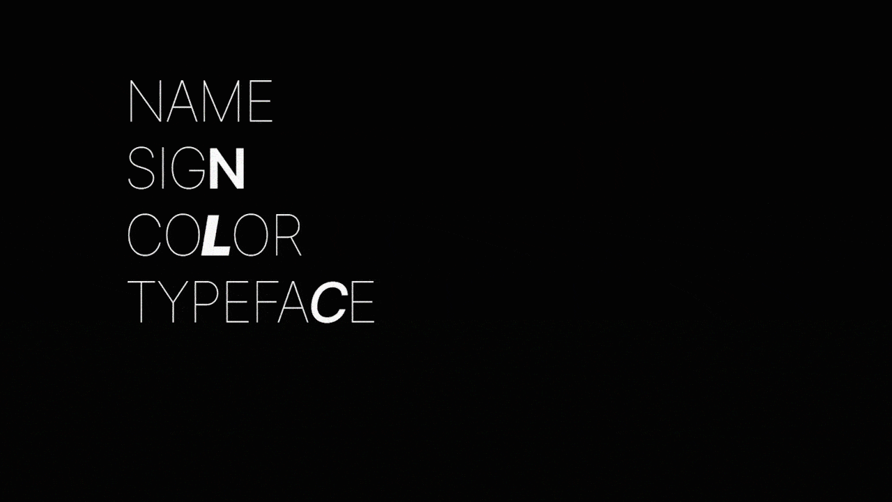
Boom and there was life, boom and there was realization. Let's talk about the elements that make up the brand identity that we talk so much about.
Ladies and Gentlemen, may we have your attention, please.
Seth Godin once quoted: "A brand is the set of expectations, memories, stories, and relationships that, taken together, account for a consumer's decision to choose one product or service over another."
Perhaps, that is the reason why you smile when you have polo and recall, 'a mint with a hole' or think of Fevicol when the linoleum on the floor peels off. Either your favorite brand is mnemonist, empathetic or cuts the mustard for you. Maybe you can't speculate but there is always a strong reason why you like a particular brand so much.
While your logo, your company's name or tagline might represent what your brand is, branding experts have crafted a more intangible definition that includes emotional, visual, historical and human aspects. Tangibly put, your product or service is your brand, but in a more unembodied context, your brand is the promise, the sum of all experiences that customers have with your company. Needless to say, a good brand is a promise kept.
Supposedly, you happen to open up the morning newspaper and see two advertisements. One with bright orange typography, or perhaps a strong design. The other a quarter-page ad, with poor fonts and a logo that seems a passé. Which one will you be looking at? Or say, which one will you find more trustworthy?
What both of these brands are selling comes later. What they are saying comes last in the natural reading sequence theory. What's more important is how they are saying it. It's the look and feel of the ad that scores the customer, even before he or she starts reading your promise. The relationship that a buyer will build is immediate and visceral. If these ads do not happen to make that first impression, customers probably won't give them a second glance. And hence brands need to understand that it's now or never.
So what is this logo, or the typography or the design that becomes the deciding factor of your brand's fate? It's the face of your brand in front of people, your brand identity. Well, of course, you have this big purpose and promise behind your brand, but you also have the visual components to translate your larger ideas and fulfill your word's worth.
Your brand identity includes your company's logo, typography, colors, packaging, and even your content. But going further, it also encompasses all the other decisions you and your branding partners take in order to make your brand appear, sound, behave and interact in sync. Something as important as your brand's values and preferences and the causes your organization supports or something as inconsequential like your office décor, the way your receptionist attends to phone calls, and even the sound of the click that your packaging makes - the whole caboodle is a part of your brand identity.
And we are not finished here. What's important is that you remain consistent at all checkpoints. Since the brand identity represents and reinforces the emotions of your brand, try to keep these components simple, clear and same irrespective of your marketing channel or advertising platform.
When you sit with your branding agency and brainstorm about crafting the brand elements (while playing darts and paper balls, of course), it is referred to as the brand identity applied. It is the actual process of creating the logo, deciding the color palette, finalizing typography that your customers will remember years down the line. The creation of brand elements is not just for a cohesive brand identity. It is also for the recognition of your brand needs and desires in the marketplace.
Hypothetically, brand elements make an essential part of the Big Brand Theory that explains why branding is so important for sustainability. Brand identity applied is the process that makes this explanation simpler.
'Now what kind of a name is that?' Surely, you do not want people to mock about your brand name over family dinners. More than mocking, you do not want them to form a perception about your company by some mere three or four-letter word.
Your brand needs a name that says all in a few letters. It defines everything that you stand for. But creating this 'less is more' effect and crafting a perfect brand name is no simple feat. You need to consider multiple variables: the identity you wish to create, the market where you will be dealing; also your overall brand strategy.
It is no luck-by-chance approach. If your brand strategist guides you right and if you can nail it down: your brand name can turn into a household name. Seriously, haven't you noticed, who says, 'I am having a frozen ice treat'. We all just know them as popsicles.
What's the quickest you can think while talking about a household name. 'Google', well now, isn't that ironic?
Now if the name is sorted, what's next? Your brand's logo is the second most important element to create a strong brand identity. It is your company's visual identity simplified into an icon. It symbolizes your brand promise.
Though it may seem gordian, the trick lies in keeping the logo simple and recognizable just as your brand name (simple and memorable). People usually go with visual memories and tend to remember your brand with the logo you create. Remember Nike's right tick or just those circles in Audi? These brands portray class and simplicity: something they embody well enough. You bet, your thirteen-year-old nephew can perhaps recognize these brands with just the logos.
Another way is to wordmark your brand name like Google or FedEx. This way, your brand name can turn into your logo. Just create a skillfully designed wordmark with branded fonts and colors and you are good to go. However, you also need to create different logo lockups (in different sizes and colors) to uphold your brand standards. When your primary logo doesn't go well on different types of collaterals, you can think of using another one with a different color and size.
Designing the perfect logo is as much fun as it is laborious. But it's a crucial part of the brand-building process. In the end, it doesn't matter what type of logo you create. The point is that it should serve the purpose: Your brand should have a dynamic and clever visual representation for the world to recognize.

(Photo by Scott Webb on Unsplash)
Why is it that you see yellow and immediately feel the warmth? Or you look at the various shades of blue and feel tranquil? Because colors have the power to influence and evoke emotions in us. It's a universal trait to feel a certain way when associating with a specific color. But then, of course, external factors also influence the effect an individual color has on a consumer. These include a customer's culture, upbringing, personal preference and his or her experiences of purchase over the years.
In the marketing context, colors hold an 85% chance to influence customer's purchase decisions. Probably why, you should never underestimate the power of the color choice for your graphics, designs, and logo.
Check out Fanta's bright orange as the main color on its logo. Doesn't it reflect zest and fun from the minute you set your eyes on it? This also explains why Barbie is pink and Puma is black. While the first one shouts out femininity, the latter conveys elegance and boldness.
Colors are a great way to attract customer attention because 80% of all the visual information the human brain takes is related to color. Apart from this they also convey a message to your market segment. As brands evolve from their nascent stage and grow older, the colors they choose become synonymous with the brand. Think of 'the Tiffany Blue' and we need not say more.
Ever wonder why your branding agency won't stop going on about how Typography is important?
Just like color, the power of typography in brand building is substantial. It conveys the values and tones of your brand through text that is arranged in an engaging, interesting and legible way.
Type says more than the word itself. It adds meaning and depth to the feeling that the copy is supposed to prompt.
Also, size matters. Would you like to read a website with small font sizes and low-contrast? Okay, forget about websites, even an email for that matter? Guess not, it would strain our eyes. Seemingly small and inconsequential mistakes such as these lead to bad experiences and negative connotations for your brand.
Look around and type is everywhere - your website, logo, social pages, posters and signages, and even the apps. And since it makes up a large percentage of a brand's identity, it's important to ensure that it is well-considered.
Type is classified into several kinds of typefaces and each one exhibits a vastly different mood or effect. Take sans-serif for example. You will find them in most of the modern-day brands who wish to portray simplicity and minimalism. On the other hand, serifs are taken to be old-fashioned. Brands prefer them more in long-form content such as blogs, brochures or even annual reports and books.
It's only wise to say that typography carries meaning, forms an essential part in brand recognition and impacts experiences.
Close your eyes and think about the way HARRY POTTER is written. It is not that difficult, you see? That's the power of type. Or the way it is typed here. Doesn't it feel like the writer is screaming when all-caps is used? That is the power of type.
Have you been able to come up with a catchy name for your brand? Does your logo make your audience shift to the edge of their seats? Then probably with a good slogan, they will be all ears to what you have to say.
The slogan you phrase defines what your brand wants to convey in a handful of words. Again, just like your brand name, it should be easy to recall, sensible of course and should be able to match your brand's personality.
For a bank or a med brand, you wouldn't want to come up with a funny slogan that leads your audience on to the wrong track. For industries such as these, customers will expect a more professional take in order to believe that their most important assets (finance or health in this example) will be taken care of.
When Loreal came up with its slogan, "Because You're Worth It" in 1973, social revolution and new spirit of feminism were in full swing. Makeup at that point in time was a controversial subject. Women wearing it were looked up to be fake and lacking respect for their natural beauty. With this slogan, the brand convinced women that there is nothing wrong in wearing makeup. Over the years, as mindsets changed, this legendary phrase demonstrated that no one has a right to criticize a woman for something she wants and loves to do.
Know what we mean when we say your slogan should be sensible?
So is your brand identity in place or you are still looking for the missing pieces of the puzzle? Crafting a brand and establishing its identity is a theory that most organizations still struggle to decode. But you don't have to do that all by yourself. Branding experts (Hint: Slangbusters Studio) are at your arm's length and will be happy to put the theory into practice.
So what are you waiting for, Christmas?
— by Tasneem Baldiwala, Freelance Content Writer, Slangbusters Studio

Confused by all these heavy words?
Slangbusters to the rescue.
We have penned down a short story for you that explains our process of branding in simple words.
Read the storyReady to make your brand more relevant in this clamorous world?
Connect with usHey, looks like you have hit the rock bottom of our website! But you can follow us on these platforms to get some behind the scene updates of the cool things happening at the Slangbusters Studio, which includes more than just our work.
903, Signature-1,
S.G.Highway,
Makarba,
Ahmedabad-380051,
India.
511 Jordan Ave,
Tallassee,
AL 36078,
USA.

All rights reserved